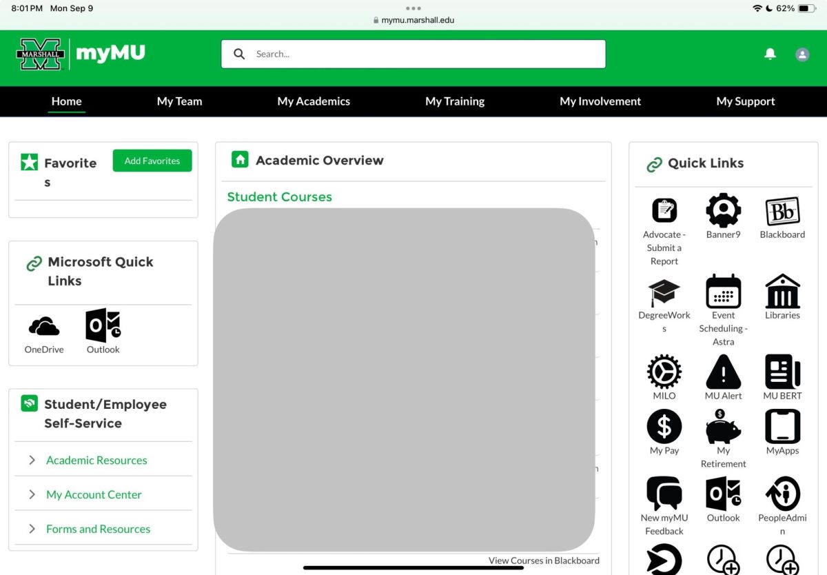
“My Team. My Academics. My Training. My Involvement. My Support.” My goodness, this is not the old myMU.
The new myMU is out and in full effect. After a week of struggling to navigate Marshall’s new academic hub, students – like myself – have found themselves wishing they could still access the old site.
Based on a social media poll conducted by The Parthenon, an overwhelming number of students said they preferred the old myMU to the new website. Out of 520 total voters, a whopping 426 voted “no” when asked if they liked the new myMU, with only 94 voting “yes.” Using these statistics, the site received an 81.9% disapproval rate and, consequently, a much lower approval rate of 18.1%.
Students’ chief complaints revolved around complications with general use of the website.
“Before, things were pretty easy to find,” sophomore Hope Fry said, “and now, it seems like everything is dispersed.”
Fry said she also did not understand why the quick link for HerdLink was taken away with the website change.
Freshman Skyler Clagg said, overall, the new myMU feels “unfinished.”
“Some links appear to be broken, leaving access to some things difficult,” Clagg said.
Following the new myMU’s release on Saturday, Aug. 31, students received an email from the Information Technology Service Desk the next day stating, “We have identified an issue with accessing the new myMU portal when using the old weblink (mymu.marshall.edu), which is causing sign-in errors.”
The email encouraged students to use a direct link, instead, and to clear browser cache to resolve the issue.
While many students expressed concerns regarding the update, others said they liked the added features.
“I think this is a change for the better due to all of the information being there as soon as you open the page,” senior Gavin Stephens said.
Stephens listed having his classes, their locations and quick links as three features he appreciated on the new home page.
Similarly, senior Garrett Shields said, “I just like the ability to see where all my classes are and their times right when I get on myMU.”
Personally, I am not a fan of this layout, and my main complaint with the website is the layout as a whole. I am often on my computer late at night and find myself longing for the old myMU home page that wasn’t so… white. The mix of green, white and black on the former home page was much easier on the eyes and, frankly, just looked better.
However, I understand the new myMU is a work in progress, and the IT desk is making changes to it daily.
Cody Hall, the customer relationship manager for Marshall IT, said myMU required an update because the site was running on old, non-supported products. He said the goal of the new site is to increase the accessibility to students’ information.
Hall said users will be able to provide feedback for the new myMU on its home page until Sept. 30, 2024.
“It’s going to be ever changing based on input and what makes the experience best for our students,” Hall said.
Baylee Parsons can be contacted at parsons406@marshall.edu