MUMobile app updates with major aesthetic, functional overhaul
More stories from Jared Casto
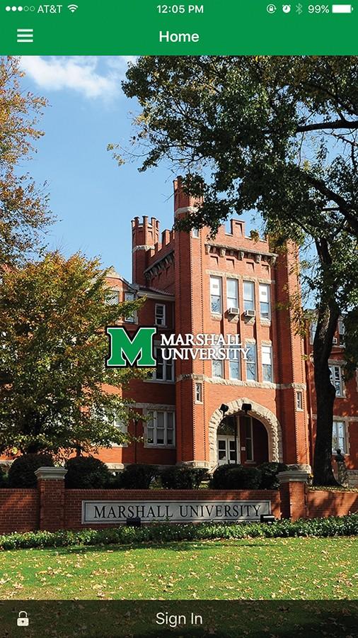
(Screenshot) An iPhone featuring the newly released MU App, April 4, 2016.
An update to the MUMobile app with a major aesthetic and functional overhaul is currently being pushed to iOS and Android devices.
The update will include a new user interface and the addition of multiple new features not present in the previous version of the MUMobile app.
Web designer for Marshall’s IT department Justin Howell said the update was necessary because the old app was outdated and not many people were using it.
“That app was starting to be outdated, just from a visual standpoint to a functionality standpoint,” Howell said. “The analytics were showing that not a lot of people were really using it as much anymore.”
Brent Maynard, director of enterprise applications, said the new app has a menu that is accessible from clicking an icon in the upper left hand corner of this app.
In this menu, information is split into five main categories: About Marshall, News & Events, Student/Faculty, Social Media and Contact Info.
Within these respective categories, students can access tools such as a campus map, a news feed with articles relevant to Marshall, class schedules and grades, Marshall’s social media accounts and important phone numbers.
“The tools that are there are very useful to students and faculty,” Howell said. “The old one just had links that went out to different web parts, whereas this one has much deeper integration with things like campus maps, campus directory, event calendars and stuff like that.”
Howell said an Apple Watch companion app will be available and will utilize many of the features supplied in the mobile app.
“It will do things like give you notifications,” Howell said. “It also has a map feature. So, I guess if you’re walking around campus and you have an Apple Watch, you can quickly find out where you’re going from your wrist.”
Senior office administrator for IT Crystal Stewart said these notifications do not include BlackBoard Learn or MU Alert notifications due to technical issues that do not permit their inclusion.
Before the new app’s release, students were able to participate in a beta testing program. Maynard said the program supplied the IT department with constructive responses and suggestions for new features within the app.
“We were just soliciting feedback and, so far, the feedback has been positive,” Maynard said. “Some suggestions like ‘Hey, can you add this,’ ‘Can we do this?’ The nice thing about the new app, the architecture will allow us to add new content much more easily than the old app.”
Additionally, Maynard said the old app was nearing the end of its maintenance cycle and the IT department decided to look for newer, better options. The department ultimately decided to go with Ellucian as the vendor for the new app. According to Maynard, over a thousand schools use Ellucian as a vendor.
Maynard said future updates to the app will include new tools and features such as integration with BlackBoard Learn.
Representatives from the IT department mostly want students to know the new app is a large improvement over the previous app and is worth the upgrade.
“The look’s new, it’s fresh, it has the organization that’s new, that’s really been planned out much more efficiently than the old app,” Howell said.
Jared Casto can be contacted at casto178@marshall.edu.
Your donation will help continue the work of independent student journalism at Marshall University. If you benefit from The Parthenon's free content, please consider making a donation.


